
There's a colour rule I use for almost every project I undertake, and it's one you should know - that is the 60/30/10 rule.
So when I start a room project and it feels a bit off, I see the same reason time and time again. A client might have bought lovely things, chosen colours they genuinely like, but the room doesn't quite come together. Most of the time the problem isn't taste….it's balance.
Either every colour is competing for attention, or everything is so safe and “same same” that the room has no personality at all. The 60/30/10 rule will help you to fix both, and once you know it, you'll start noticing it in every room.
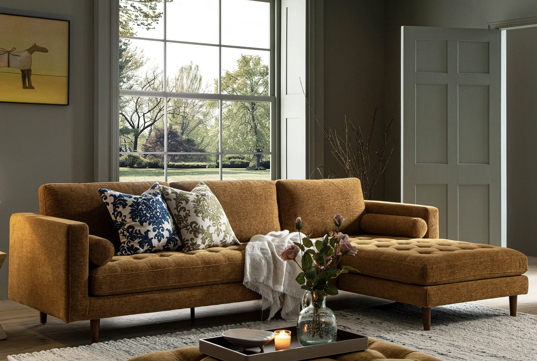
Here the 60/30/10 rule works in reverse: olive walls take the lead, an ochre sofa brings warmth, and patterned cushions add the finishing accent. Image: Daals.
What is the 60/30/10 rule?
In a nutshell, it is a simple way to divide a room's colour into three roles and each colour has one job to do. I actually summarised it into a table below - press the + sign to reveal the roles each has to play:
-
Role: Dominant neutral
Usage: Walls, flooring, larger upholstery
-
Role: Secondary tone
Usage: Curtains, a feature chair, cabinetry
-
Role: Accent
Usage: Cushions, a throw, an occasional piece, artwork
The 60 is the calm. It's the backdrop that makes everything else look really good. It make the 30% and the 10% colours pop! Your eye needs to rest with this colour, so make sure it doesn’t fight to be seen.
The 30 is the character. This is the colour people remember when they leave your home. It should be one that you really love, and not one that you simply just tolerate or think is “ok”.
The 10 is the jewellery or icing. A little goes a long way, and that's the point of this one. You should use it sparingly, and use a tone that feels deliberate and considered.
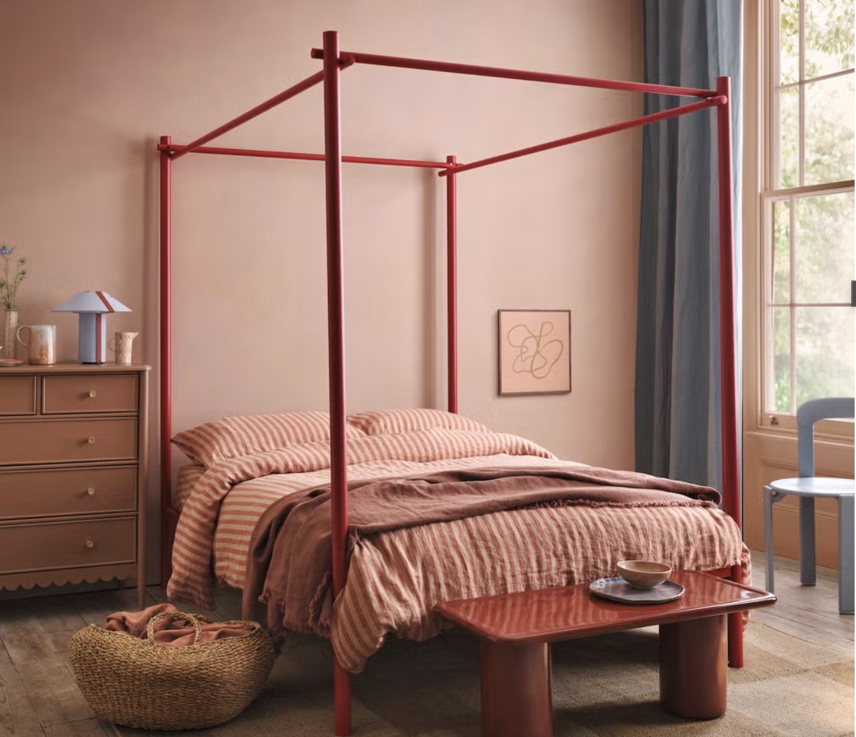
A tonal take on 60/30/10: soft plaster pink walls and deeper clay tones in the bedding and chest of drawers make up the 60%, while the slim red bed frame and seat provide the 30%. The 10% is blue, in the curtain and lamp. As the only cool tones in the room, they keep all that warmth from feeling too bright. Image: House Beautiful
Choosing your 60 in UK light
The 60 is the hardest to get right and the most expensive to get wrong, because it covers the most surface. Here in Scotland where I live, our light is cool and grey for much of the year. A brilliant white that looks crisp in a sunny showroom can actually feel cold and flat in an Edinburgh tenement by November. That's why I almost always lean towards neutrals with a little warmth in them: soft creams, stone and putty tones rather than stark whites or blue-greys.
I always say test a large sample on more than one wall, and look at it in the morning, at midday and under lamplight in the evening. A colour can change completely across a single day but also in different lights. That also applies to the different temperatures of bulbs for downlights.
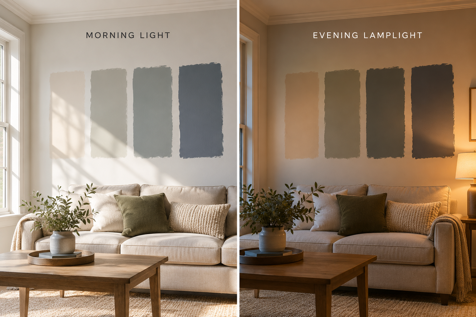
The same four paint samples in morning light and evening lamplight. The warm neutral on the left holds its character all day, while the cooler greens and blues turn dark and murky once the lamps go on. Always test your colours at different times of day before you commit.
Let’s Create an Example
I love these fabrics and chose some neutral and warm colours from Isle of Skye Paints and Little Greene.
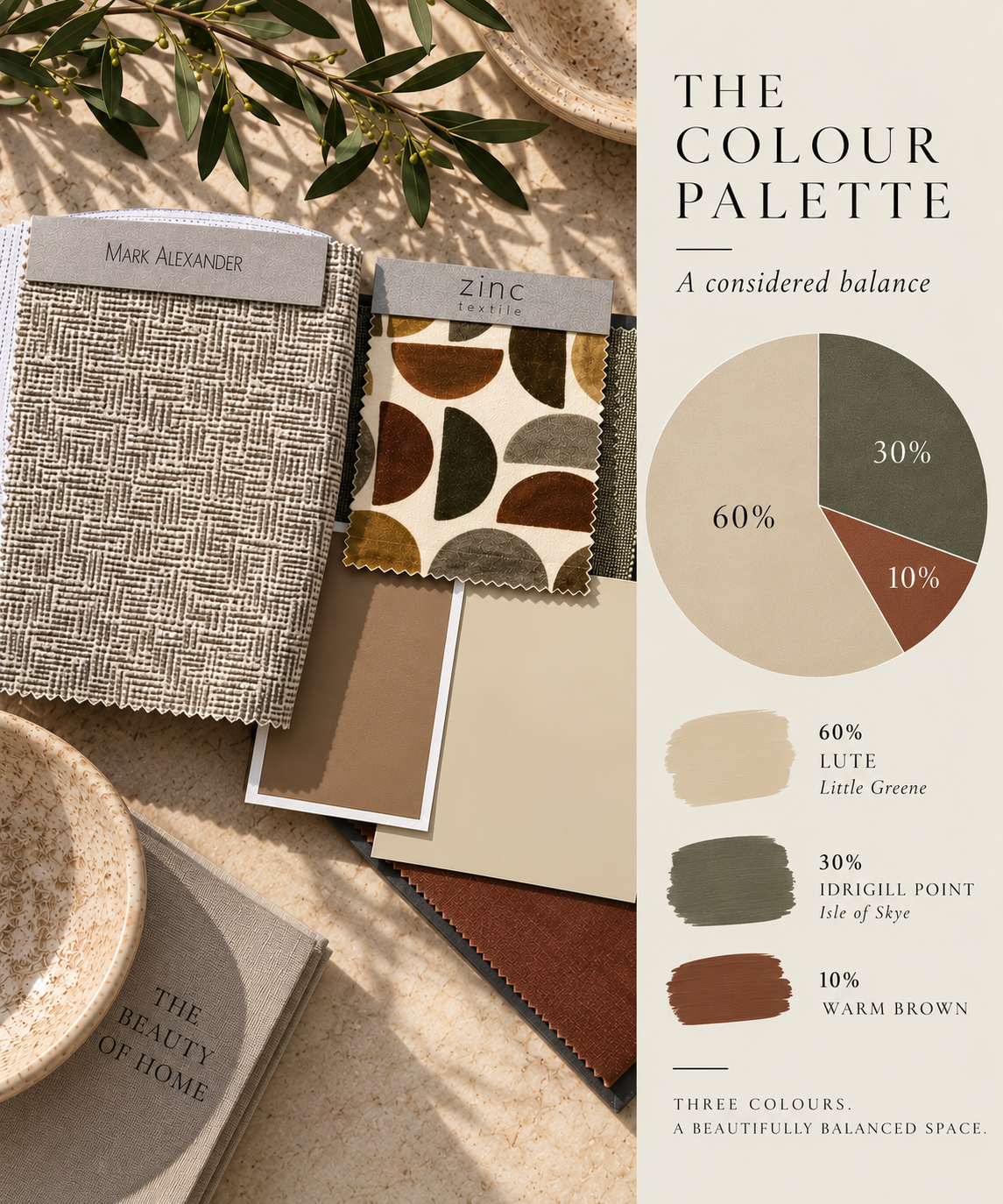
This is a moodboard I created as it all works well together and have seen this colour scheme pop up in my feeds of late:
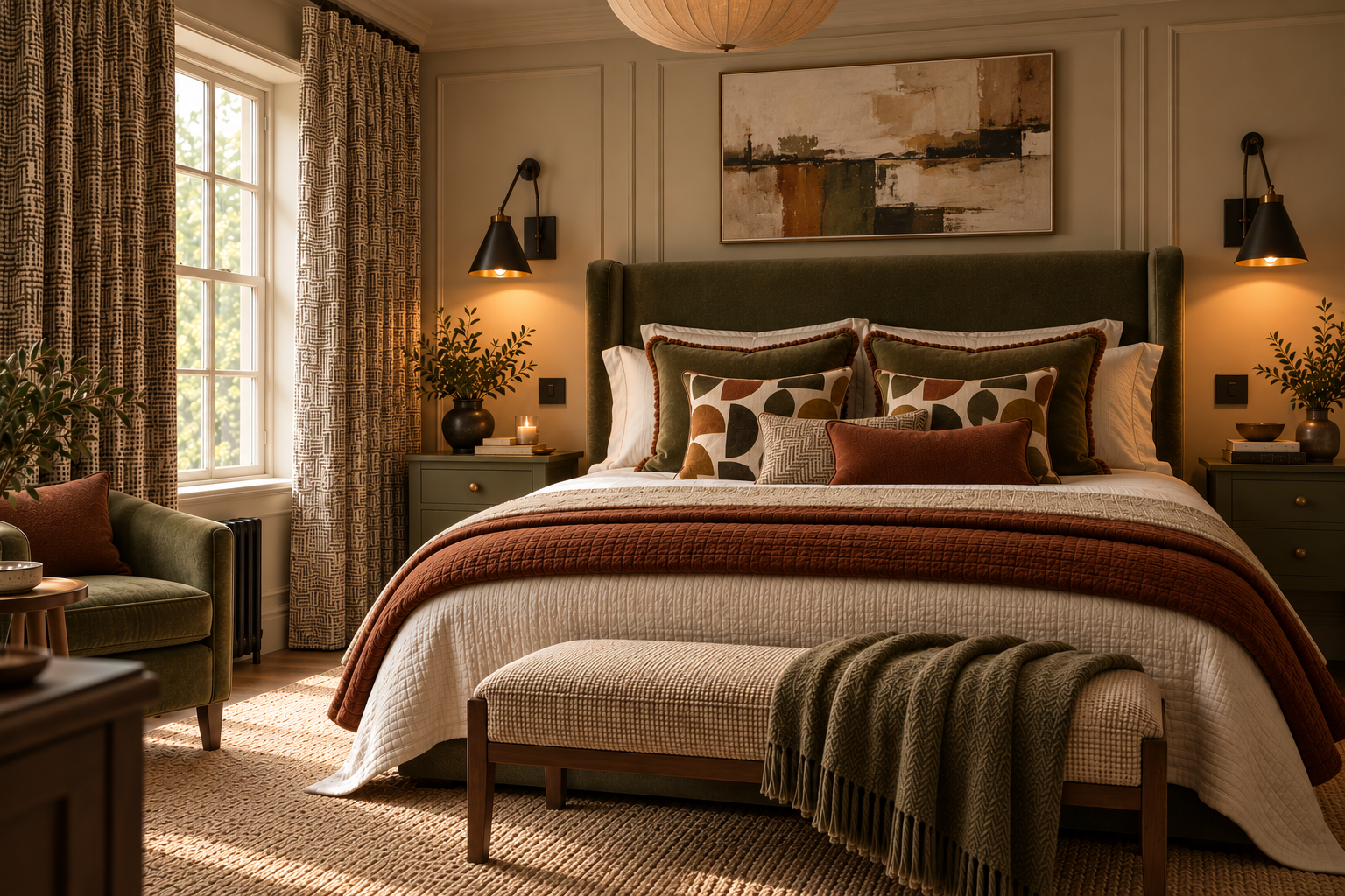
The moodboard is brought to life. Lute covers the 60% across the panelled walls, bedding and rug. Olive green takes the 30% in the velvet headboard, bedside tables and armchair. The rusty brown adds the 10% in the quilt and cushions. The half-moon cushions using the Zinc fabric pull all three colours together. Visualisation: Renée Turner Interiors.
I actually played around with AI to create a bedroom using this moodboard.
For this palette, I started with Lute by Little Greene as the dominant 60%. It's a soft, creamy neutral that warms up beautifully in low light without ever tipping into yellow.
Idrigill Point from Isle of Skye carries the 30%. It's a deep, earthy olive that feels grounding without being heavy, and it works as well on a velvet armchair as it does on kitchen cabinetry or a pair of lined curtains.
A rich warm brown brings the final 10%. It's the colour that makes the whole scheme feel alive. Picture it on a pair of cushions, a throw over the arm of a sofa, or a single ceramic on a shelf.
All three colours sit in the same warm, earthy family, which is why they feel so calm together. Nothing is fighting for attention and the room has real depth.
Colour gets all the attention, but texture is what stops a calm scheme from feeling flat. The Mark Alexander weave gives the neutral real depth. You want to reach out and touch it. The Zinc velvet half-moon print does something even more useful: it brings all three colours together in one fabric. A patterned piece that pulls your whole palette together like this is worth its weight in gold. If you find one, build the room around it. It does half the work for you.
How to use it in your own home
Start with what you're keeping. It might be the flooring, your existing kitchen, or a sofa that you love. Work out which of the three roles it's already playing. This is going to be your anchor piece
Choose your 60. Pick a wall colour that is warm and will be the main background to your anchor point. Paint it out and test it in your own light, at different times of day. Compare it and look at how it interacts with your anchor.
Choose your 30. This is your personality colour. Make sure it sits comfortably beside your 60, either in tone or in warmth.
Add your 10 last. Accents are the easiest and cheapest thing to change, so leave them until the bigger decisions are settled.
Bring in a pattern that links them. A fabric in a curtain or blind, rug or piece of art containing all three colours will make the scheme feel intentional.
Think of the percentages as a guide….it’s not a maths test ok. You're aiming for the feeling of balance and I don’t want you to use this guide as a measuring tape.
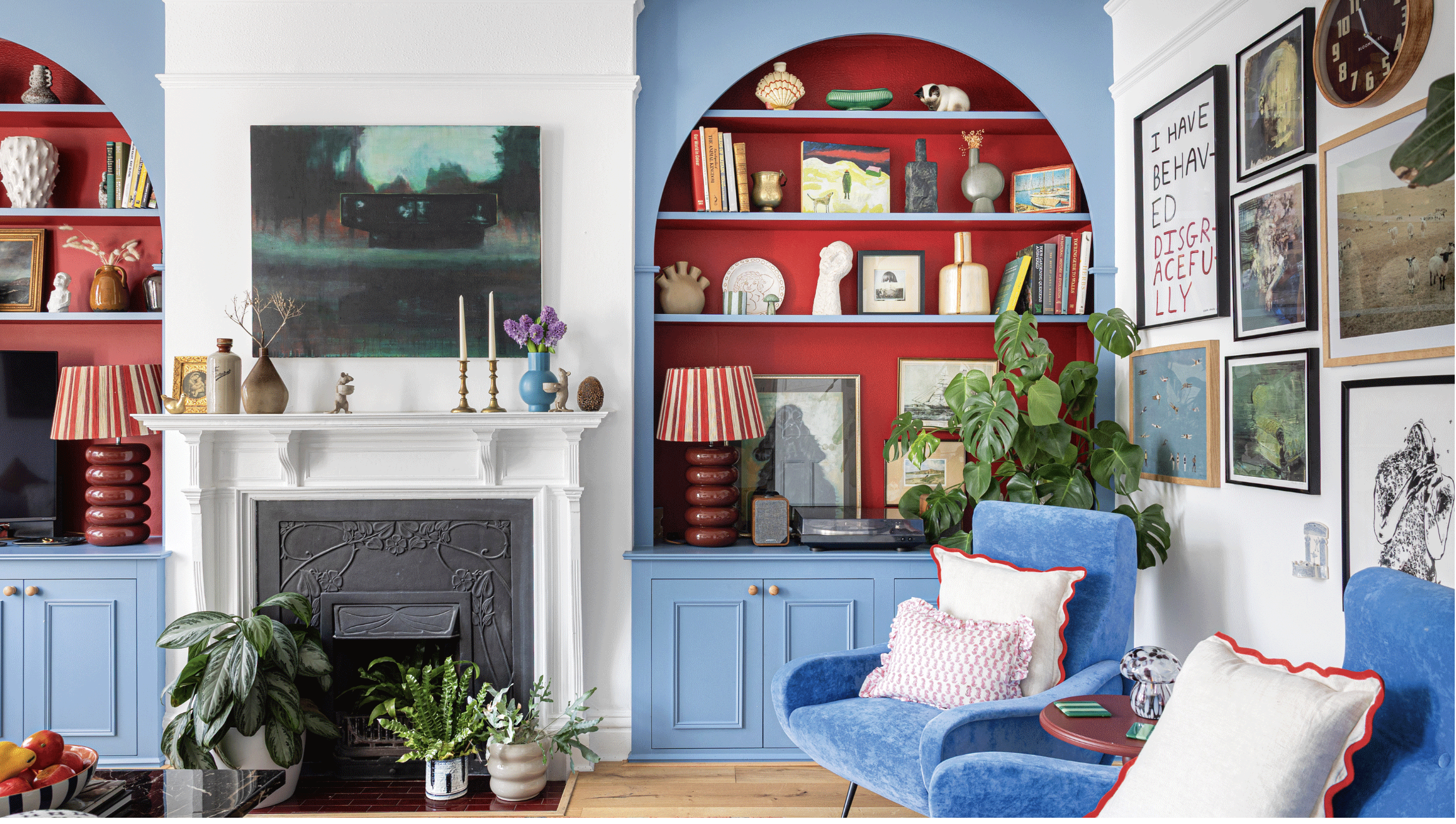
A bolder take on the rule: white walls as the 60%, cornflower blue cabinetry and chairs as the 30%, and red as the accent. Notice how the red appears again and again, in the alcoves, lamps, cushion trims and side table. That repetition is what makes a bold accent look deliberate. Image: Ideal Home
Three colours, endless possibilities
The beauty of 60/30/10 is that it works with any palette, from soft and scandi to deep and dramatic. Once you've got the balance right, the colours themselves are entirely up to you.
If you'd love a palette like this created for your own home, my Moodboard by Mail service does exactly that. I have already pulled together colours, fabrics and finishes that work in your space and your light, and post them to your door so you can see and feel them before you commit. Take a look at the page here: Link
